Guiding the User
Smart Navigation for Complex Applications
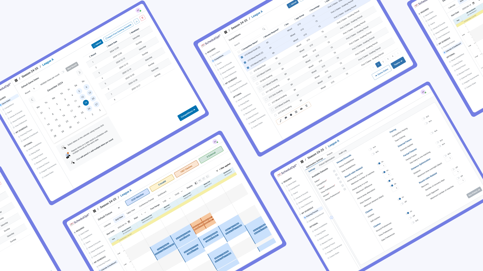
I started this navigation research because I wanted to redesign the sidebar for our current product, SchedulOpt.
While exploring navigation patterns in popular applications, I began to notice recurring themes and techniques. The insights I gathered through this research inspired me to write this summary.
Understanding User Needs: "Where Am I? Where Am I Going?"
Navigation design starts with two core questions:
① Where am I?
② Where am I going?
These questions should be closely integrated with component design in order to clearly explain the function each component plays within the navigation system.
Where Am I?
In complex application navigation, clearly indicating the current location is crucial. Since systems often involve page transitions and interconnections, marking the current position helps users understand where they are and facilitates their operations. Common components include page headers, pagination, progress indicators, anchor links, and navigation menus.
For complex systems, the header design is particularly important as it helps users quickly grasp their current position within the system and avoid getting lost. Some complex applications use headers frequently due to their broad range of services, ensuring users always know where they are.
Where Am I Going?
Navigation should guide users clearly from one point to another. Common components such as anchor links, pagination, dropdowns, and menu items can define the flow of information and support smooth transitions between tasks.
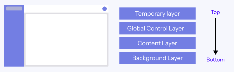
1. Complex Application Structure
The structure is divided into four layers:
- Background Layer: Provides static elements
- Content Layer: Displays core functions and data
- Global Control Layer: Includes global navigation and control panels
- Temporary Layer: Displays feedback and popup messages, located at the topmost layer
2. Types of Navigation
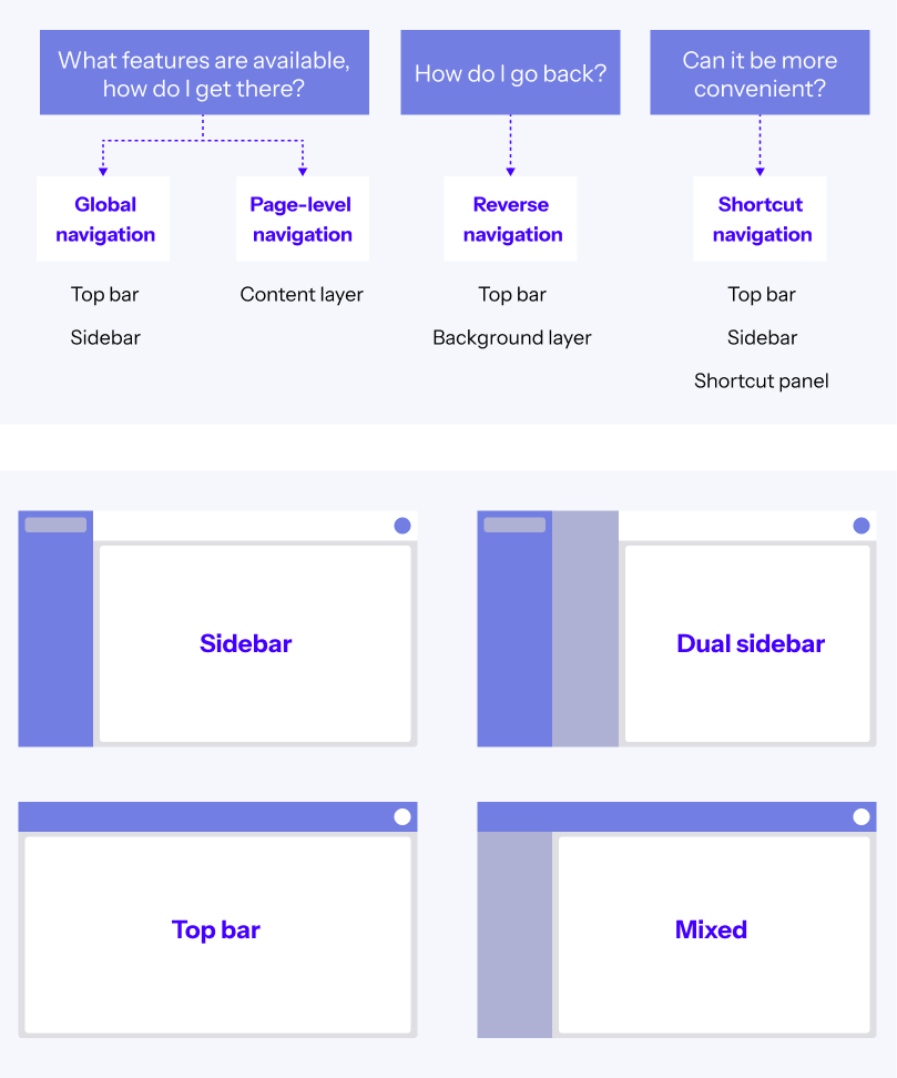
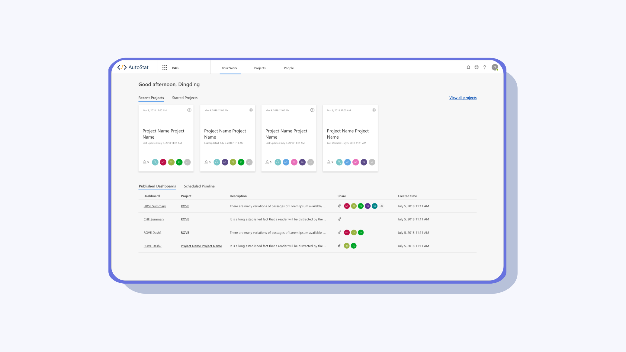
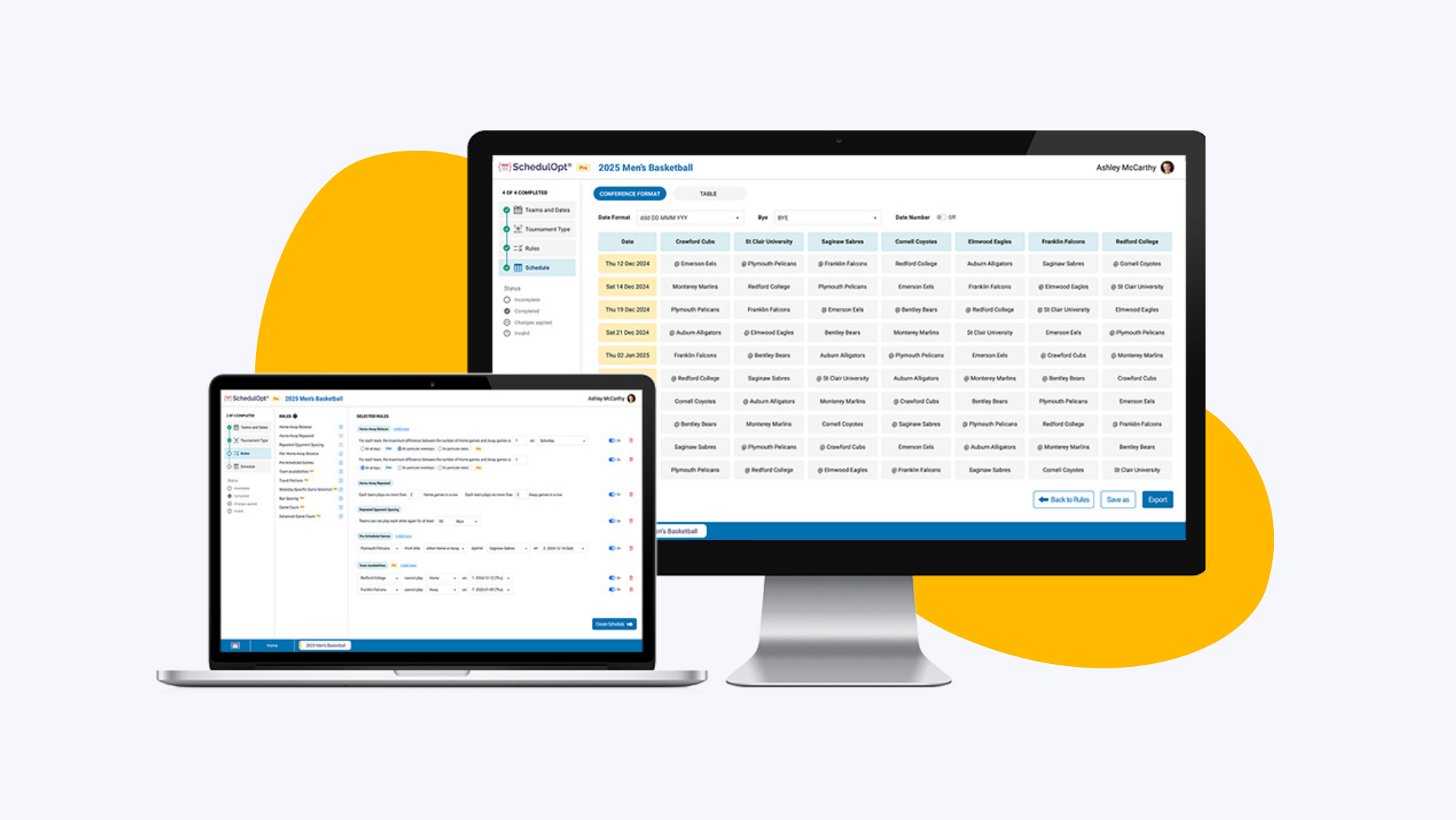
2.1 Sidebar
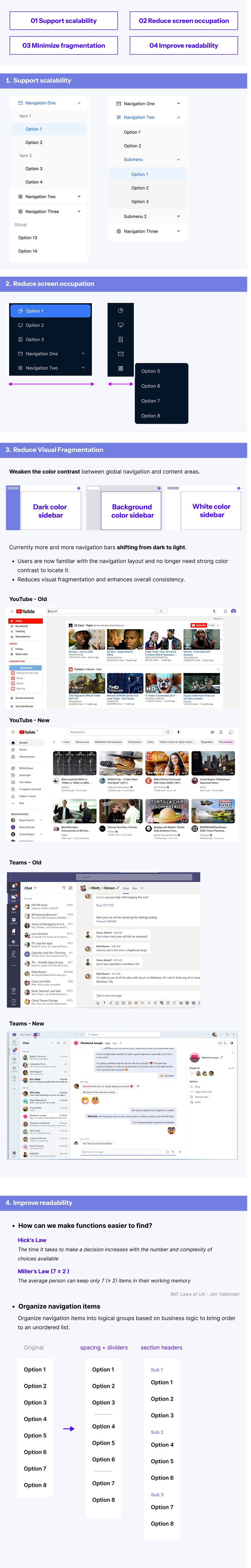
Sidebar navigation clearly displays multiple levels of functionality, saving page space and improving operational efficiency. It usually stays fixed on the page, supports fast access and switching, and helps users better understand system structure. It’s suitable for complex hierarchical systems and systems displayed on large screens.
2.1.1 Pros
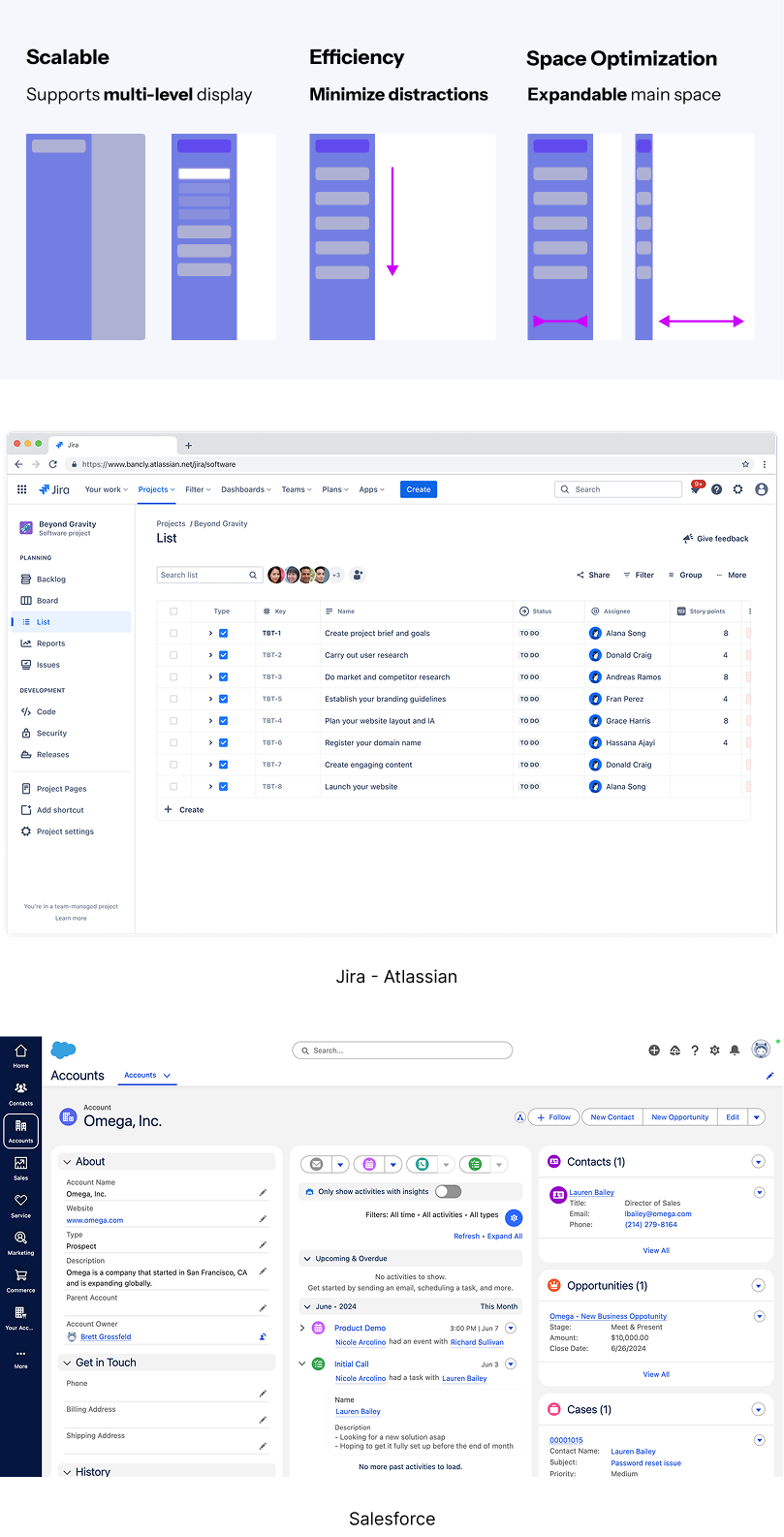
2.1.2 Key Design Points
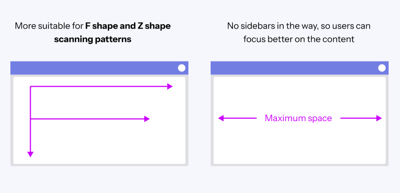
2.2 Top Bar
Top navigation provides a clean and concise entry point to help users quickly access core functions, ensuring efficient and consistent operation. It is especially suitable for systems with few functions or simple structures.
2.2.1 Pros
2.2.2 Cons
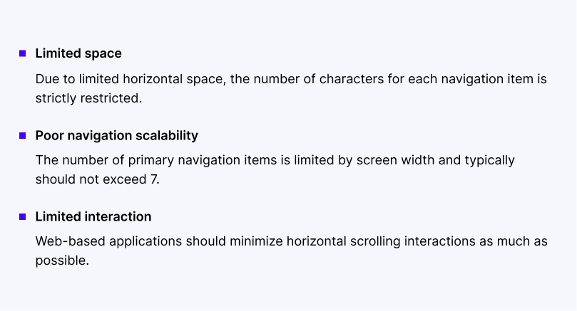
2.2.3 Key Design Points
2.3 Page-level Navigation
Page-level navigation helps users quickly locate sub-features within a specific module, clearly shows the hierarchy, and improves on-page operational efficiency.
2.3.1 Page-level Navigation Types
2.4 Reverse Navigation
2.4.1 Reverse navigation Types
3. Navigation Design Principles
3.1 Follow the 7±2 Rule
The "7±2 Rule" suggests limiting the number of navigation options to between 5 and 9 items. This is based on psychologist George Miller's research on short-term memory, which shows that people can typically hold 7 (plus or minus 2) items in memory at once.

Chunking information into smaller groups makes it easier for people to remember things in the short term.
In practice, chunking information into smaller groups helps users process it more easily. Applying this principle to navigation makes interfaces more intuitive and easier to remember.
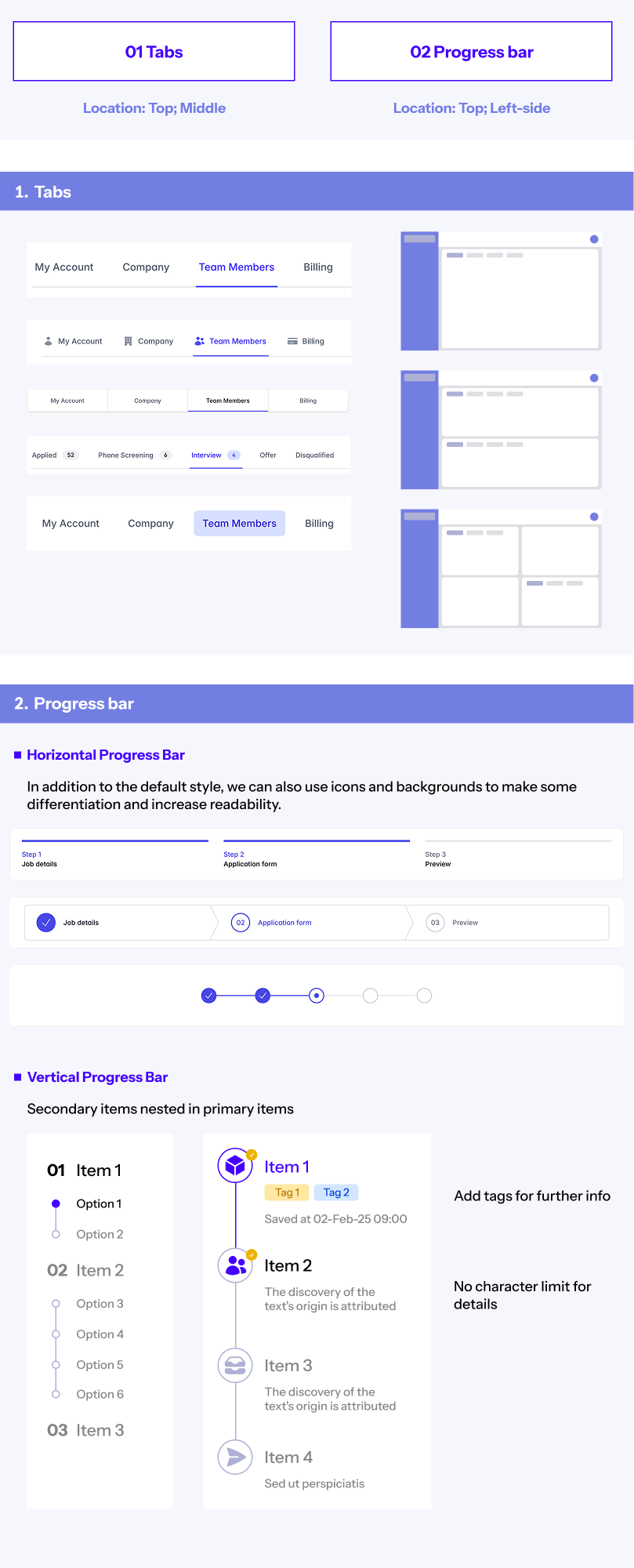
3.2 Avoid More Than Two Levels of Navigation
If a menu structure goes deeper than two levels, it usually signals overly complex information architecture.
The more levels a navigation structure has, the more likely it is to degrade the user experience. In cases where third-level navigation exists, it’s common to optimize the design by merging or hiding some of the menus. This simplification reduces cognitive load and streamlines user interaction, enhancing the overall experience.
3.3 Hover vs. Click Interactions
Though hover and click may seem like simple interactions, their use cases and design implications vary greatly. There’s no absolute right or wrong between them - it depends on context and strategy.
① Hover Interaction:
Hover-triggered actions are often brief, which may make users feel the interface is unstable or inconsistent, potentially leading to frustration. When selecting a submenu, even slight mouse movements can cause the menu to disappear or become unresponsive, worsening the experience. We must pay attention to the responsiveness and duration of hover states.
Best Use Case: Hover interactions are suitable for single-level navigation, where quick access to submenus is useful and unlikely to cause confusion or disorientation.
② Click Interaction:
Click interactions are commonly used in multi-level navigation. When a user clicks, they receive clear feedback and can be confident that the menu won’t disappear simply by moving the mouse away. This method provides more stability and is better suited for complex navigation structures. It offers a more defined interaction path and helps reduce uncertainty during operation.
Best Use Case: Click interactions are ideal for complex navigation structures with multiple layers, where clear feedback and guidance are necessary to ensure smooth user interaction.
4. Managing Navigation Hierarchy
4.1 Color Differentiation
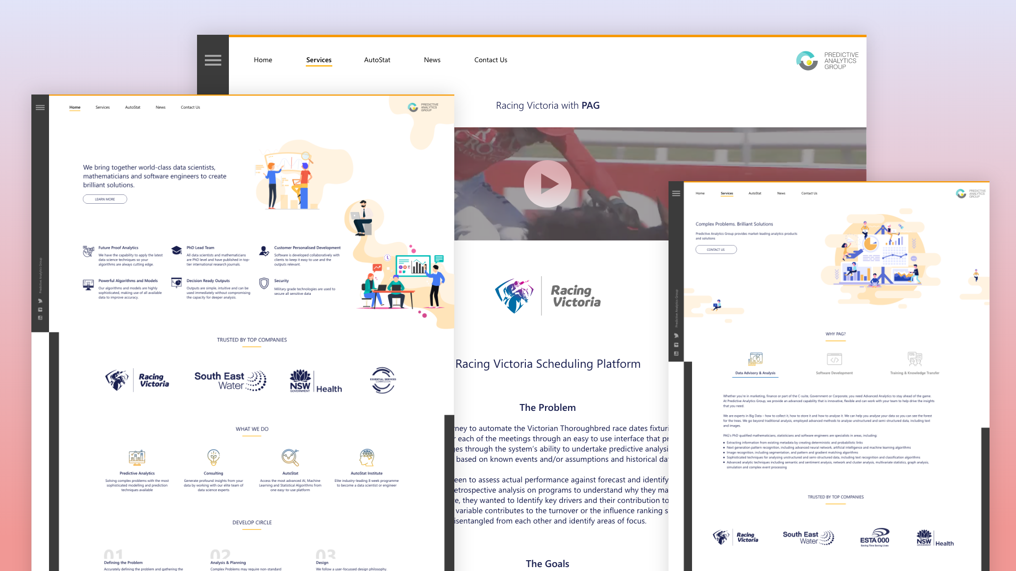
In 2019, major platforms like YouTube, Twitch, and X (Twitter) revamped their web interfaces, eliminating unnecessary blocks and grey backgrounds. By increasing whitespace and simplifying layout, they embraced a cleaner aesthetic.
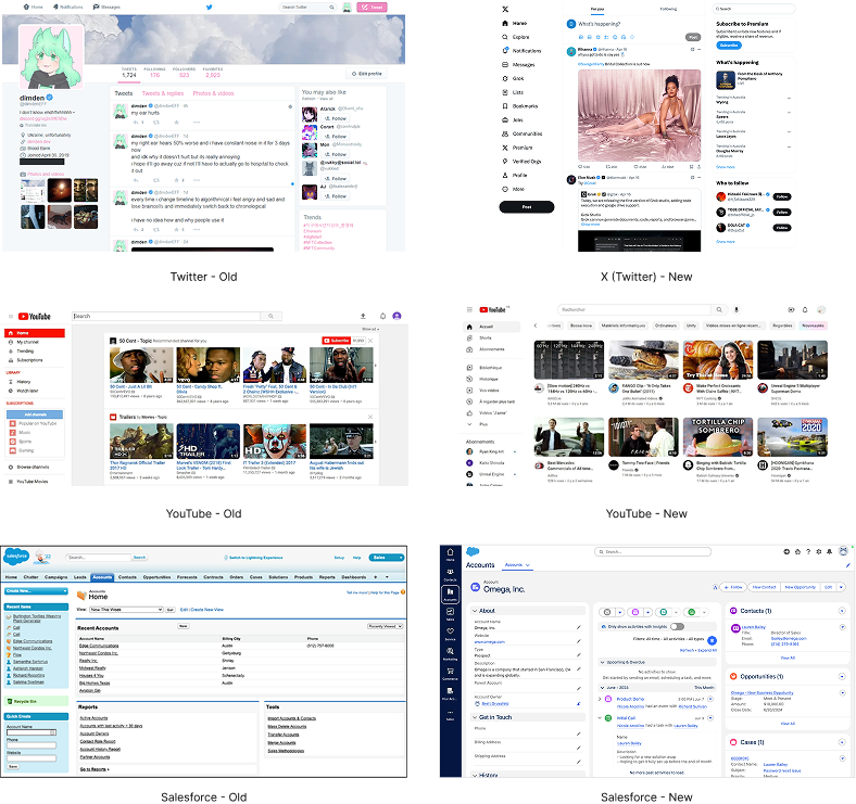
As web design trends move toward minimalism, B2B products are also adopting cleaner interfaces. In B2B design, color differentiation is commonly used to distinguish between navigation and content layers, helping users easily identify different business modules. This approach is especially useful in complex systems, as it's clean and intuitive.
4.2 Shadow-Based Differentiation
Shadows and elevation add visual hierarchy and depth. Mobile design patterns have influenced web UI by using diffuse shadows to separate layers. This enhances clarity in navigation, helping users quickly interpret structural relationships.
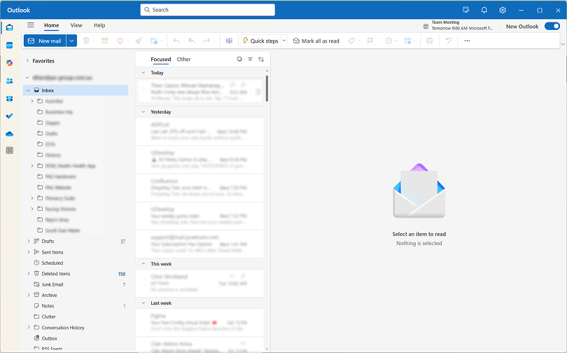
Outlook uses shadow effects to emphasize component hierarchy, supporting better navigation comprehension and usability.
4.3 Divider Lines
Dividers separate content regions but should be used with care:
Too strong: Creates visual fragmentation.
Too light: Fails to clarify structure.
The key is to balance aesthetic design with functional clarity.
Many interfaces use simple lines combined with white space to clearly separate the navigation area from the content area, resulting in a clean and visually appealing layout.
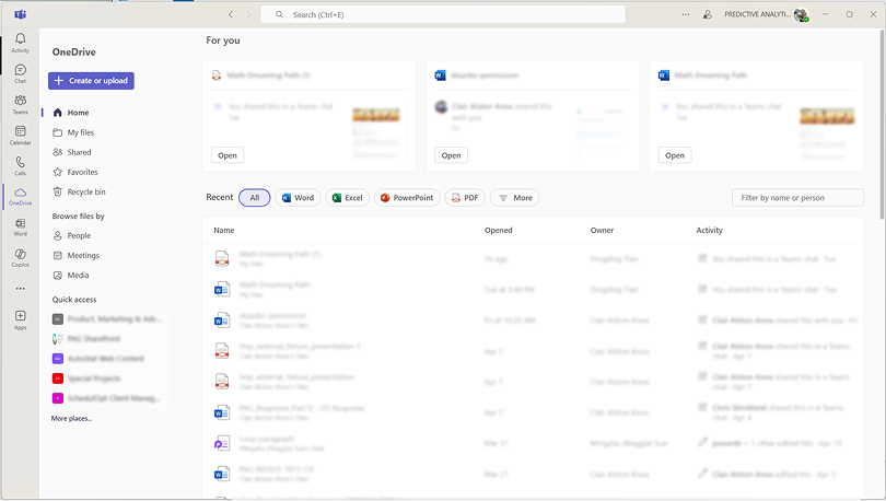
Teams
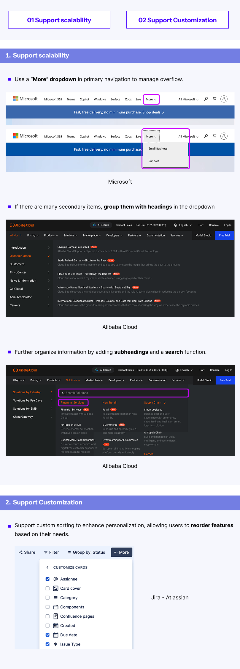
5. Balancing Menu Breadth and Depth
5.1 Menu Breadth
Breadth refers to how many items exist at each menu level. When the number grows too large, user efficiency suffers. Design strategies can address this:
Example: Microsoft
Full Menu: Displays all 100+ products.
Search Function: Lets users quickly find specific items.
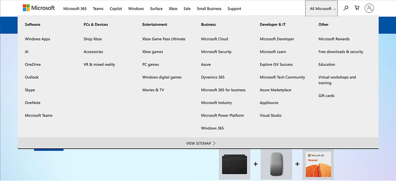
Microsoft
This dual approach satisfies both browsing and targeted access needs.
5.2 Menu Depth
When faced with deeply nested menus, we can optimize in the following ways:
① Collaborate with Product Managers:
It's essential to clearly understand the intent behind the menu structure. This involves discussing whether the current hierarchy is too complex and if it can be simplified. To aid these conversations, we can use tools like mind maps to visualize the structure in advance, this helps clarify logic and makes discussions more efficient.
② Create User Journey Maps for Each Role:
Even though B2B products often serve complex and varied user needs, we can identify usage patterns by analyzing user flows.
For example, in a medical system:
- Receptionists, consultants, doctors, and business owners all have different priorities.
- Business owners may care about sales data and performance metrics, while doctors focus on patient treatment records.
By mapping each role’s key tasks and frequently used features, we can tailor menu structures accordingly. This ensures that the menu aligns with user needs, avoids unnecessary complexity, and improves usability and system efficiency.
Conclusion
Navigation is the skeleton and roadmap of any enterprise product, connecting complex business needs with streamlined user workflows. By mastering structure, interaction principles, and visual hierarchy, we can build navigation systems that are not only efficient and user-friendly, but also scalable and adaptive to evolving product requirements. Thoughtful navigation design empowers users and strengthens business outcomes.