Project Summary
SchedulOpt® is a powerful scheduling platform that helps competition managers create optimized game schedules in minutes. Initially developed as a sub-feature of AutoStat, it inherited its parent platform's navigation structure. However, as SchedulOpt matured and its core functionality diverged significantly from AutoStat, the need for a dedicated and intuitive navigation experience became clear.
With a growing user base and increasingly complex scheduling needs, the previous design was no longer scalable. The navigation interface displayed all tasks at once - mixing linear and parallel processes - causing confusion and inefficiency. This redesign project aimed to restructure information and improve interaction to enhance clarity, usability, and user flow.
Challenges
Inherited Navigation Structure: SchedulOpt retained AutoStat’s flat layout, which wasn’t aligned with its functional complexity.
Hybrid Task Flow: Required Data tasks needed to be completed sequentially, while Optional Data tasks were parallel and flexible.
Inefficient Interactions: The bottom navigation bar combined different user flows, requiring frequent clicks and navigation reversals.
User Confusion: Users had difficulty identifying their current location in the workflow and the next logical step.
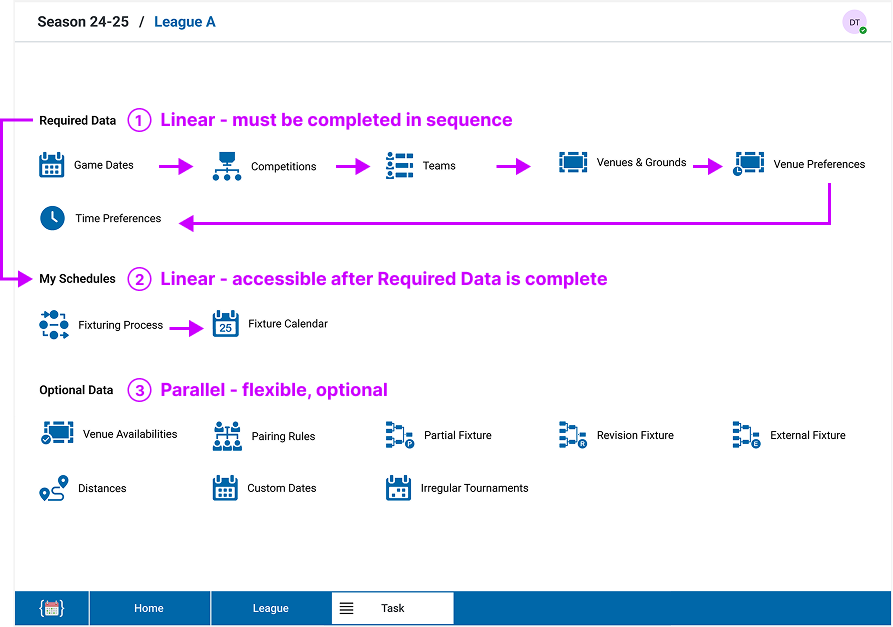
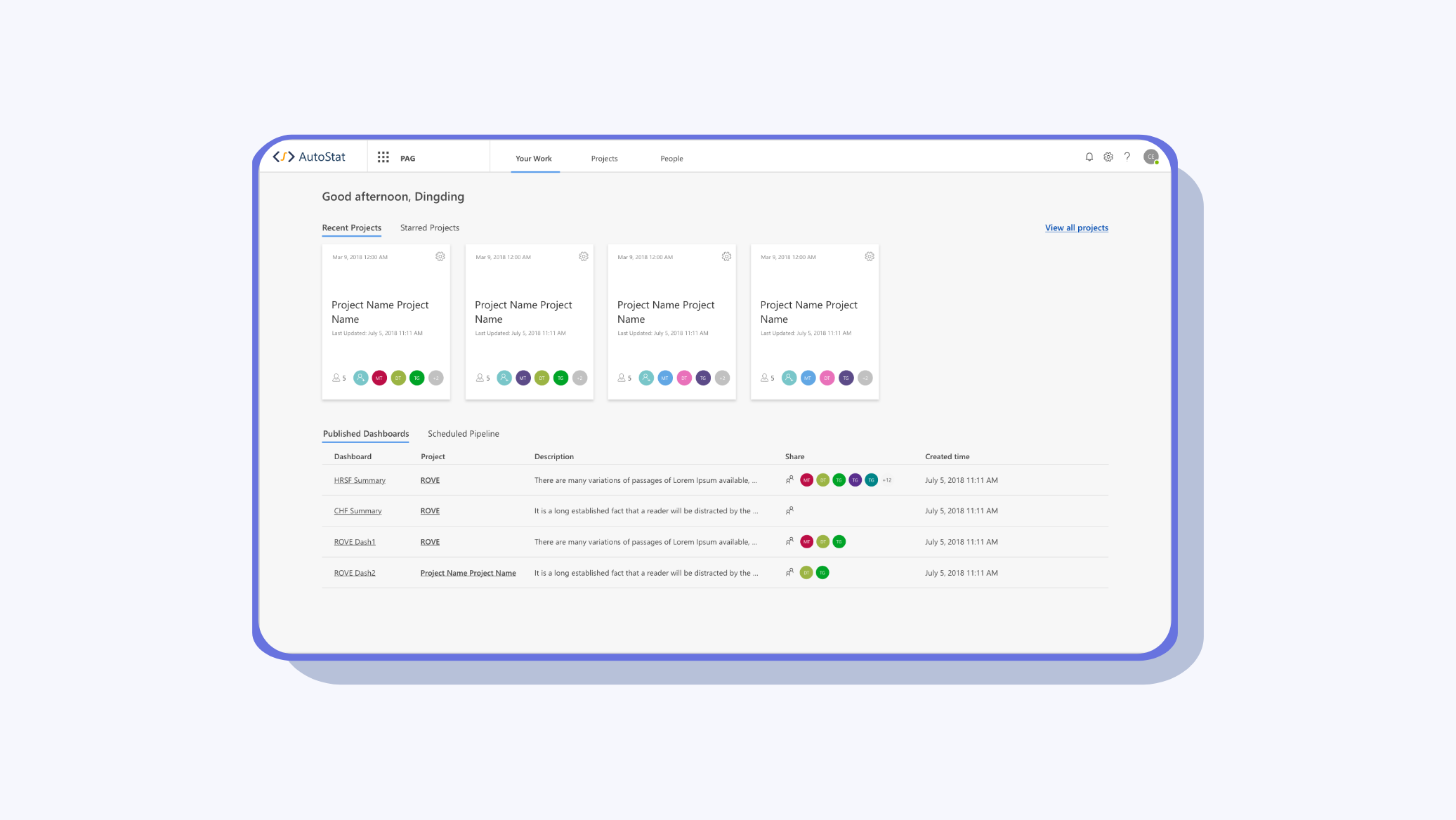
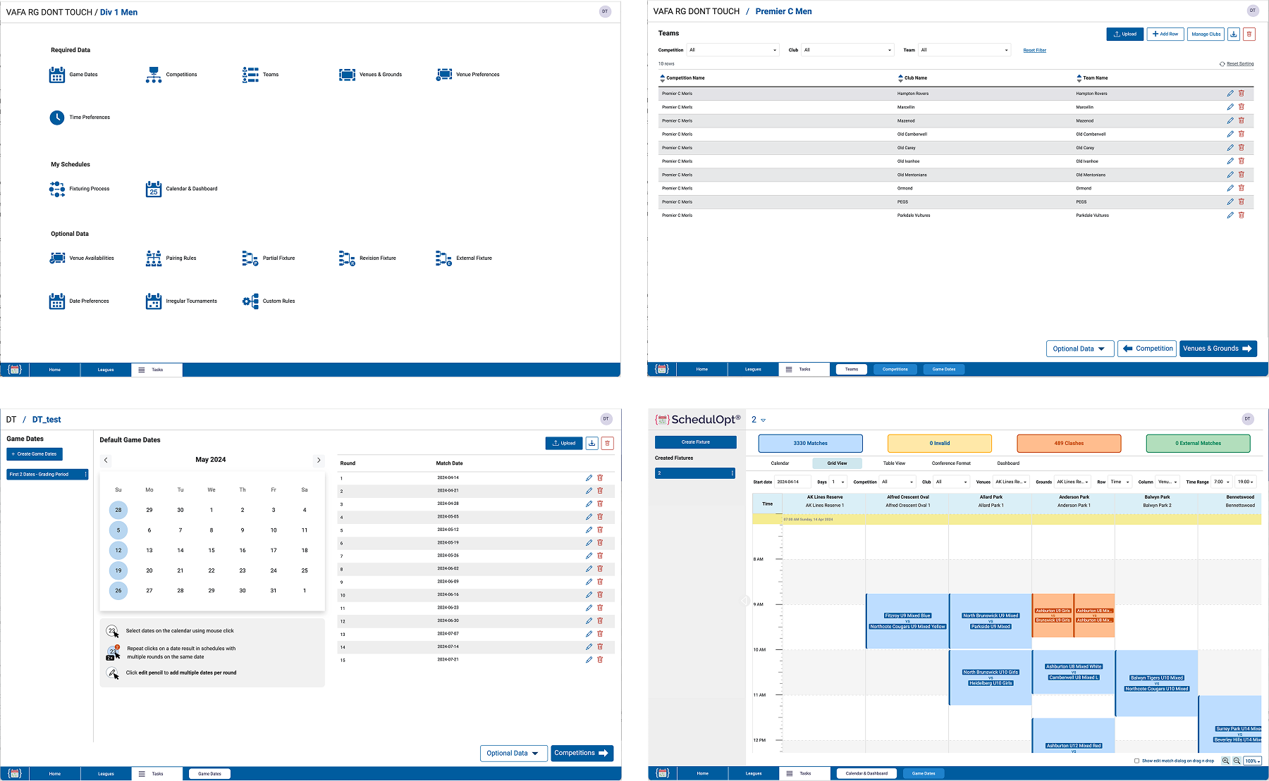
Before - Task page showed all tasks in a flat list, blending linear and optional flows.
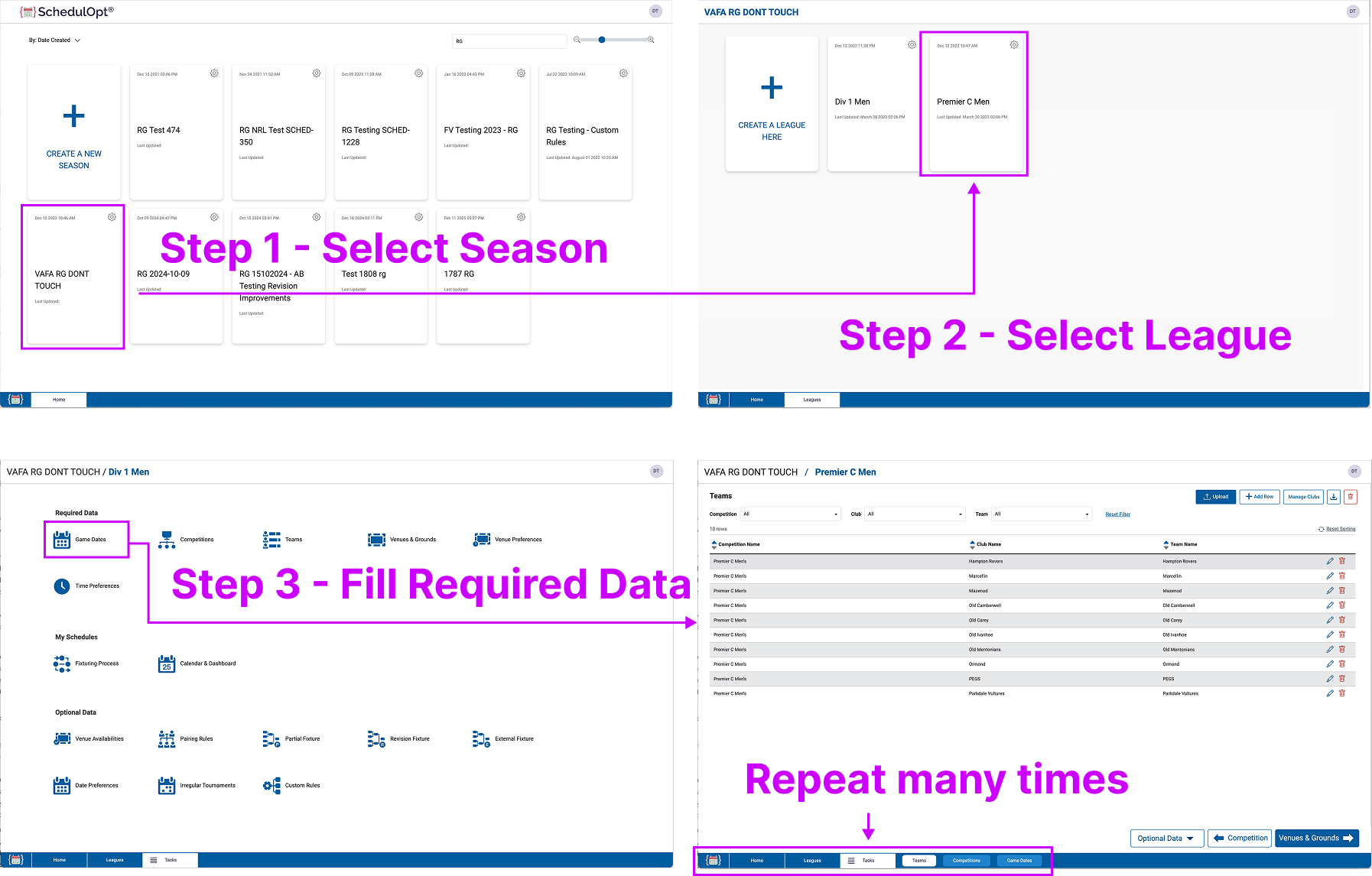
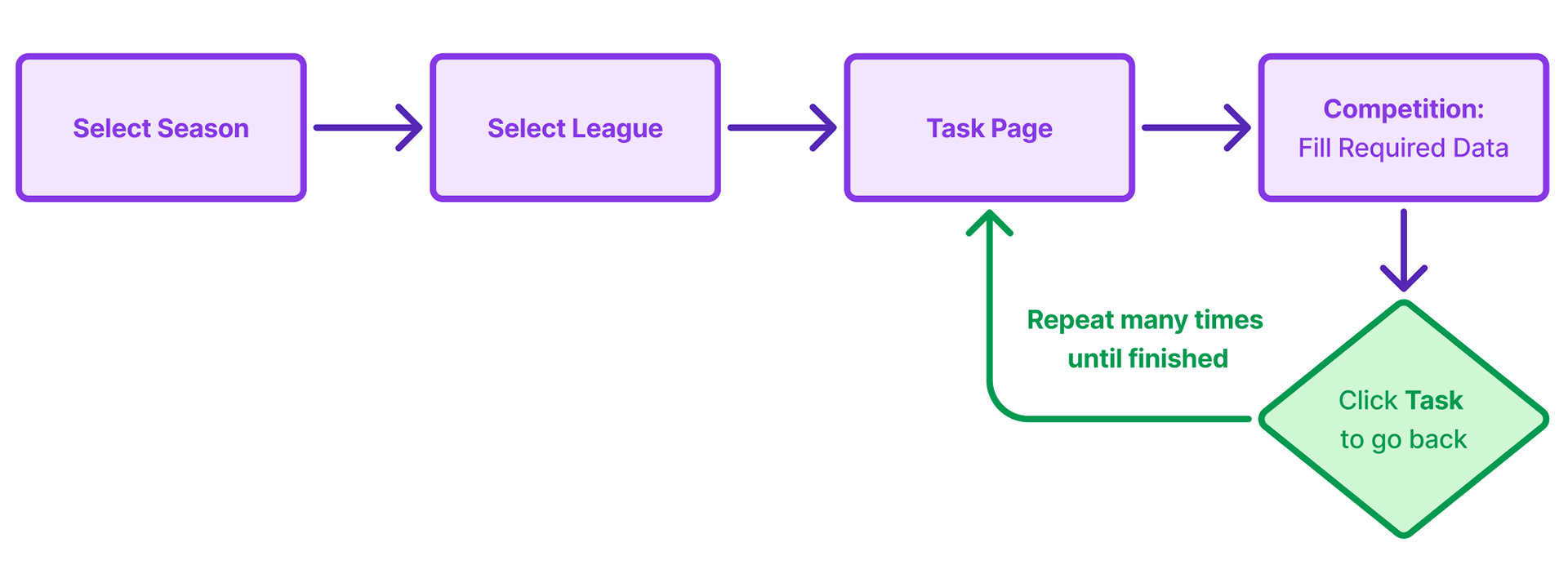
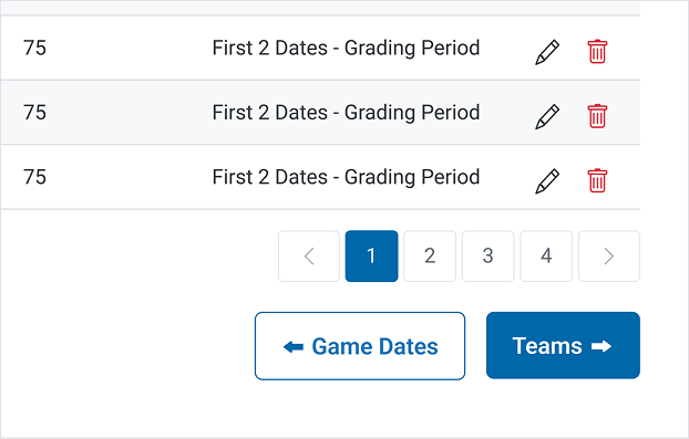
Before - Uploading data felt like click… repeat… click… repeat.
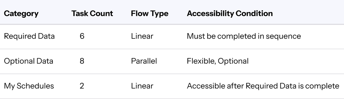
SchedulOpt included three major categories:
Required Data (6 tasks): Must be completed in a fixed order.
Optional Data (8 tasks): Users can complete in any order or skip.
My Schedules (2 tasks): Only accessible after all Required Data is completed.
Redesign Strategy - Let the progress bar speaks
To address the navigational confusion uncovered in user research, we focused on answering two key questions throughout the redesign:
“Where am I?” - Helping users understand their current location within both the broader workflow and the data structure.
“Where am I going?” - Guiding users toward the next logical step, whether that’s completing the next task, uploading data, or generating a schedule.
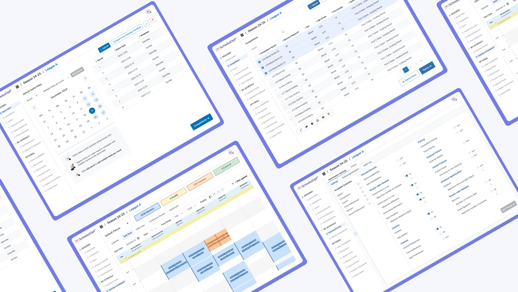
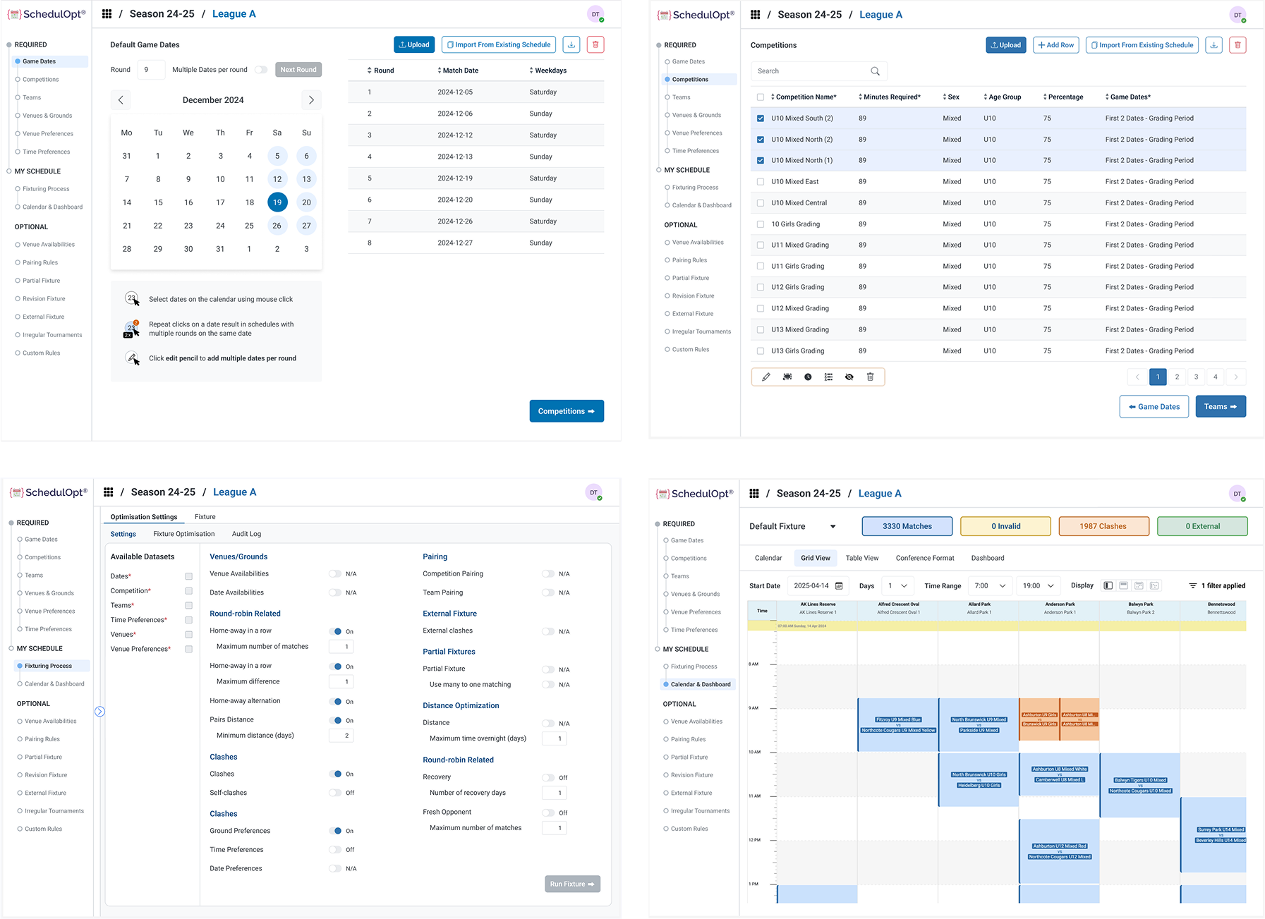
After - Let the progress bar speaks
The redesign focused on two core areas:
1. Information Reconstruction
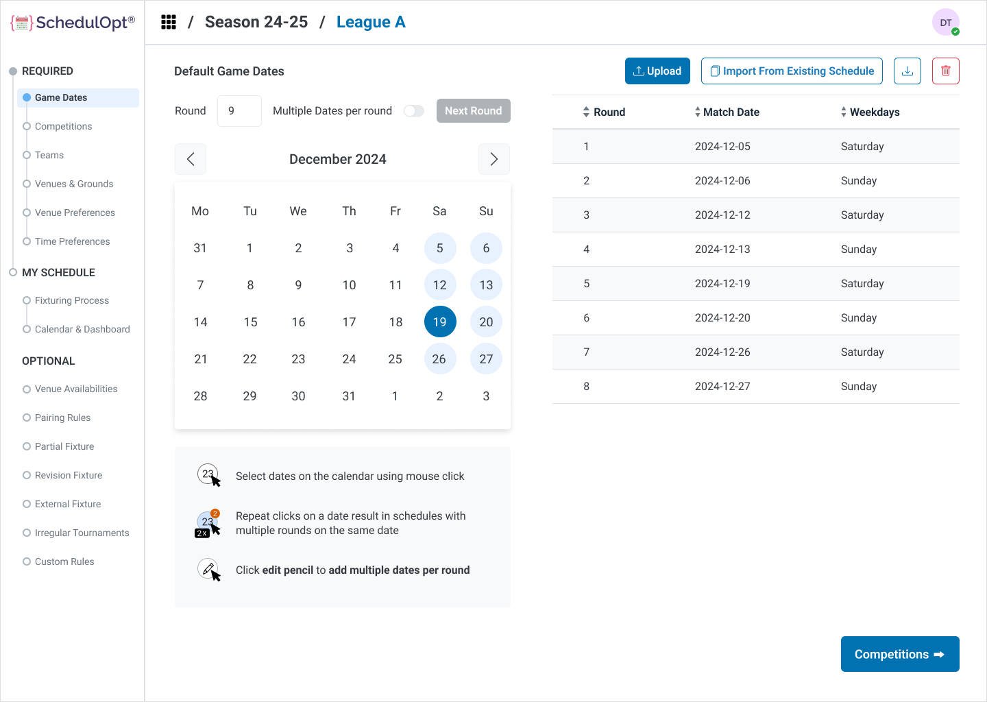
a. Hierarchical Stepper Navigation
We restructured the navigation to provide a clear sense of location and direction. A two-level progress stepper was introduced:
Outer Stepper: Represents the overall user journey from Required Data → My Schedules ; Optional Data.
Inner Stepper: Dedicated to the six sequential tasks under Required Data, providing immediate clarity on progress within the linear path.
Two-layers Stepper
b. Visual Prioritization
We visually separated Required Data, My Schedules, and Optional Data using spacing and section labeling. Optional tasks were not hidden but styled differently to indicate they’re non-blocking. This helped reduce the sense of overwhelm and kept the focus on the main journey.
2. Interaction Improvement
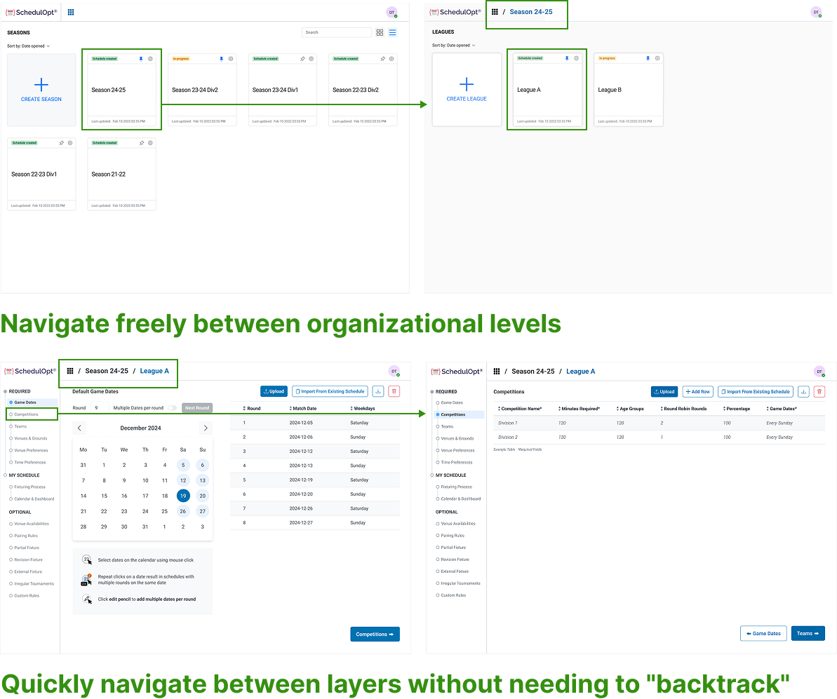
a. Replacing Bottom Navigation with Top Menu and Breadcrumbs
The bottom navigation was removed and replaced with a top navigation bar that includes a breadcrumb-style path -> Menu / Season / League
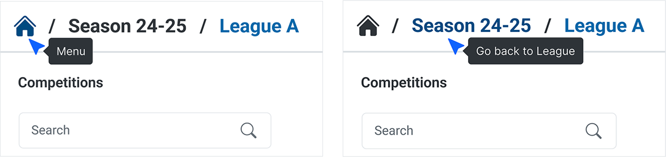
Breadcrumbs
This allows users to:
- Instantly understand where they are in the product hierarchy
- Quickly navigate between layers without needing to "backtrack"
- Clearly distinguish between the content management flow (Seasons & Leagues) and the task execution flow (Required → Optional → My Schedule)
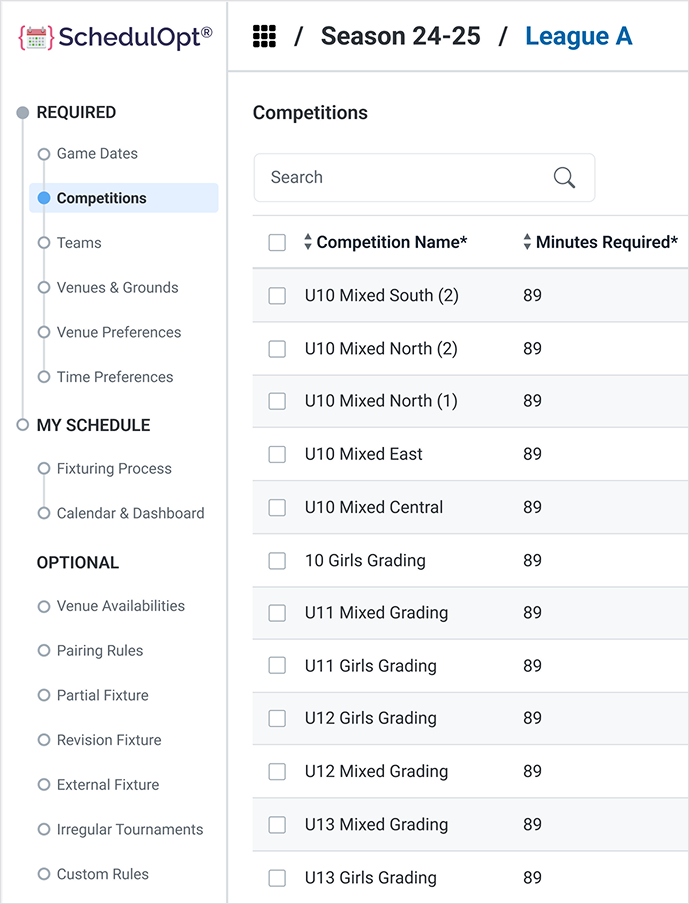
b. Sidebar Task Management
A new sidebar menu was introduced to list all 16 tasks in their respective groups:
- Required Data (with progress indicators)
- My Schedules
- Optional Data
Each group is collapsible, and tasks are marked with status indicators (e.g., complete, in progress, not started). This reorganized structure helps separate the two major user flows: data input (tasks) and organizational hierarchy (season/league).
After - Users completed tasks more efficiently with fewer clicks and clearer guidance.
c. Next and Previous Buttons
Within the Required Data path, we added Next and Previous buttons to guide users smoothly through the linear workflow. This allows users to move through the required steps efficiently without returning to the task overview each time.
This small but powerful change:
- Saves time and reduces repetitive actions
- Reinforces the linearity of the Required Data flow
- Keeps users focused and in context
Outcome
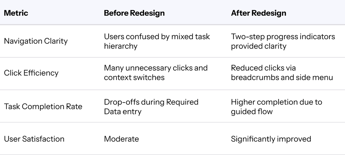
Improved Usability: Clear separation of linear vs. optional flows reduced user confusion.
Faster Navigation: Breadcrumbs and the sidebar minimized unnecessary clicks and context loss.
Better Task Completion Rates: Users were more likely to complete all required steps thanks to the structured, guided flow.
Positive Feedback: Early user testing showed significant improvements in navigation clarity and overall satisfaction.
Before
After